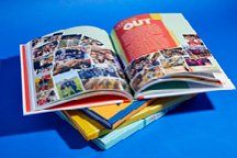
Carry your theme throughout the book
The cover is only the introduction to the theme. Open the book to really connect to the concept.
Theme is a central idea that’s expressed in the yearbook visually and verbally. Built around a word or phrase, the theme becomes the book’s identity and personality. It’s the glue that holds a book together, providing a cohesive look and feel throughout the book.
It’s important to maintain that consistency from one page to the next. Primary places we should see the theme include:
- Cover
- Title page
- Theme opening
- Theme closing
- Division pages
- Parting page
- Folio
The Pioneer did an exceptional job carrying out their theme in the Kirkwood High School yearbook. Their concept “What it means” is clearly articulated on the cover and two of the opening spreads. The dividers also expand on the theme verbally. Each division spread, like the fall one, notes events and activities that connect to the “what it means” to be a pioneer idea. The visual look of the theme is also carried out well. We see the bold sans serif type in all caps, as well as bright colors utilized in color bars and blocks.

Another primary place to see the theme is on the folio. Folios are a reader service, providing the page number and spread topic. They also sometimes include the section of the yearbook and the designer. Kirkwood’s folios use their two fonts and a color block, simple ways to establish consistency throughout the book.

To unify the theme from page to page, it’s essential to showcase the theme in secondary places as well. This could include:
- Module headlines
- Showstoppers
- Whole book links
- Club & team group photos
- Ads
- Index
Opening any page of the book, it should be obvious what school it is. The Pioneer staff excelled at this with their secondary theme coverage. Every spread embodies their theme visually, with their two fonts and smart use of color. Throughout the book, quotes are highlighted with color bars, as seen as on the September current event showstopper and cross country spread. It’s also smartly used with their sports team photos, with quote sidebars at the bottom of the layout. Even their index included the quote highlight look, with each division letter. All four layouts employ color and typography to keep the theme visible throughout the book.

Creating a cohesive and uniform look is essential to theme development. Carrying out the concept visually and verbally will provide consistency and reinforce the book’s identity and personality.


